Dickover UX is the newly popular label for a very old irritation: a website or app covers the thing you came to read and asks you to do something else first. John Gruber coined the term in a May 29 Daring Fireball post, and the reason it landed is simple. Everyone has lost patience with cookie walls, newsletter nags, app install prompts, and fake must-click dialogs that treat attention like a hostage.
Table of Contents
The short version
- A dickover is a modal, popover, or curtain that blocks content for an interaction the reader did not ask for.
- The test is necessity: sign-in for paid content is different from a newsletter prompt that appears before the article.
- The Hacker News thread mostly agreed with the annoyance, but argued over the business pressure and privacy-law incentives behind it.
- Product teams should review overlays in private browsing sessions, because returning staff often never see the first-run mess new users face.
- For more coverage of product and web design patterns, see the IT & AI archive.
What happened
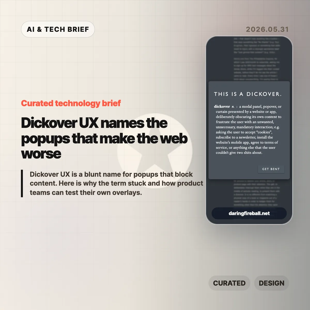
Gruber defines a dickover as a modal panel, popover, or curtain that deliberately obscures a site’s own content to force an unwanted interaction. His examples include cookie consent panels, newsletter signups, mobile app install prompts, and terms prompts that appear before the page gives the user what they came for.
The post is not arguing that every modal is bad. A paywall login panel can be part of the content transaction. The sharper complaint is aimed at overlays that serve the site’s secondary goals while interrupting the user’s primary task. That is why dickover UX is less a technical category than a product judgment.
Gruber also separates dickovers from “dickbars,” his term for partial-width or edge-anchored bars that do not fully block the page. Those can still cover text, break keyboard paging, or distract the reader, but the full-screen curtain is the bigger sin because it demands dismissal before the page can be used.
Why this is worth watching
The useful thing about dickover UX is that it gives teams a rude but memorable name for a pattern they often normalize. Most teams do not set out to make hostile pages. They add one prompt for legal coverage, one for growth, one for email capture, one for app installs, and one for retention. The user experiences the stack, not the org chart.
The term also catches a gap in design reviews. Teams often evaluate whether the modal works, converts, and complies. They spend less time asking whether it deserved to appear at that moment. A high-converting overlay can still teach readers that the site will interrupt them whenever it wants something.
There is an app lesson here too. Mobile teams use notification prompts, rating prompts, permission dialogs, and install nudges in the same spirit. If the prompt appears before the user has received value, it feels like rent collection at the front door.
What Hacker News readers are arguing about
The Hacker News discussion was mostly sympathetic to the term. Many commenters treated it as a relief to have a word for the reflexive popups they already dismiss with Escape, browser filters, or uBlock Origin rules. Several people praised the value of naming bad patterns because a memorable label makes them easier to ridicule inside teams.
The strongest disagreement was about incentives. One camp argued that readers are not entitled to a clean page if the site depends on ads, email capture, or other conversion mechanics. The counterargument was blunt: the browser is the user’s agent, and once a site sends a page to it, the user can filter and reshape that page locally. That split matters because it frames dickovers either as a price of access or as abuse of the reader’s machine and attention.
Cookie consent drew the longest side debate. Some blamed European privacy regulation, while others pointed out that GDPR does not require full-screen annoyances. The more practical complaint was about malicious compliance: companies can satisfy lawyers while making rejection harder than acceptance. Commenters also noted Global Privacy Control as a better browser-level direction, though many sites still ignore it.
The most useful operator point was simple: teams may not see their own damage. Staff, executives, and developers often accepted the cookie prompt years ago or browse from known networks, so they miss the chain of captcha, cookie wall, newsletter modal, app prompt, and checkout interruption that hits new users.
dickover UX checklist
A practical dickover UX review should happen before the growth experiment ships, not after complaints arrive. Run the page as a first-time visitor and watch for any prompt that blocks reading, hides the dismiss option, or asks for a commitment before the product has earned one.
The practical read
Treat every overlay as a small tax on trust. Before shipping one, ask five questions.
- Is this required for the user to complete the task they started?
- Can the user keep reading or using the page without answering now?
- Is the dismiss action as visible as the accept action?
- Does the prompt appear after the user has already received value?
- Have you tested the page in a private window, on mobile, and from outside the company network?
If the answer gets uncomfortable, the overlay probably belongs later, smaller, or nowhere. Dickover UX is a useful term because it makes a buried product tradeoff sound as ugly as it feels.