Tag: UX

  • Gmail AI is pushing one longtime user out

    Gmail AI is pushing one longtime user out

    Gmail AI is no longer a quiet side feature for every user. In a June 1, 2026 post, developer JP described leaving a 16-year Gmail account after the web UI kept inserting AI summaries, reply drafts, and writing prompts into ordinary email work. By June 2, the post had reached Hacker News, where the discussion drew more than 600 points and hundreds of comments about forced AI in everyday tools.

    The short version

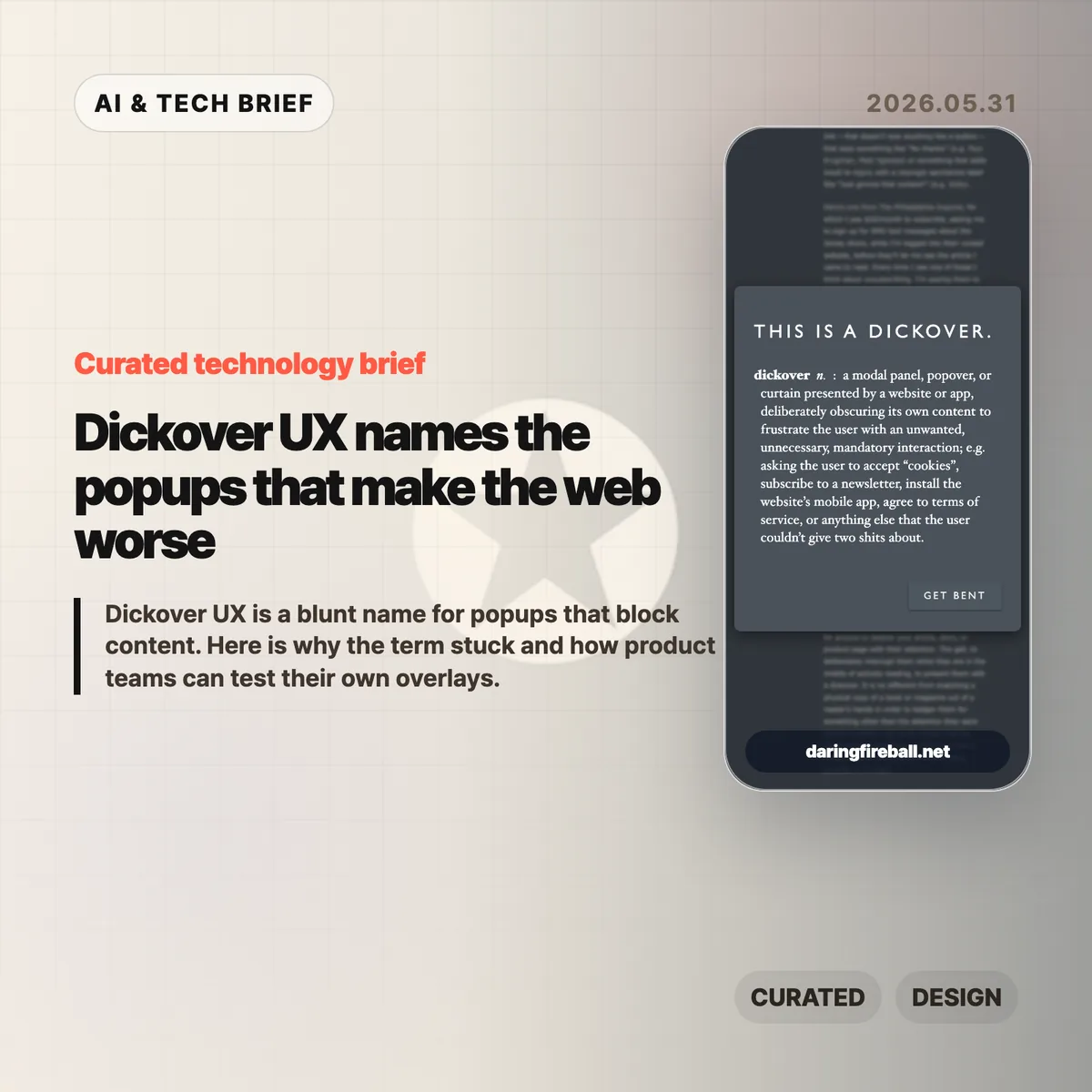
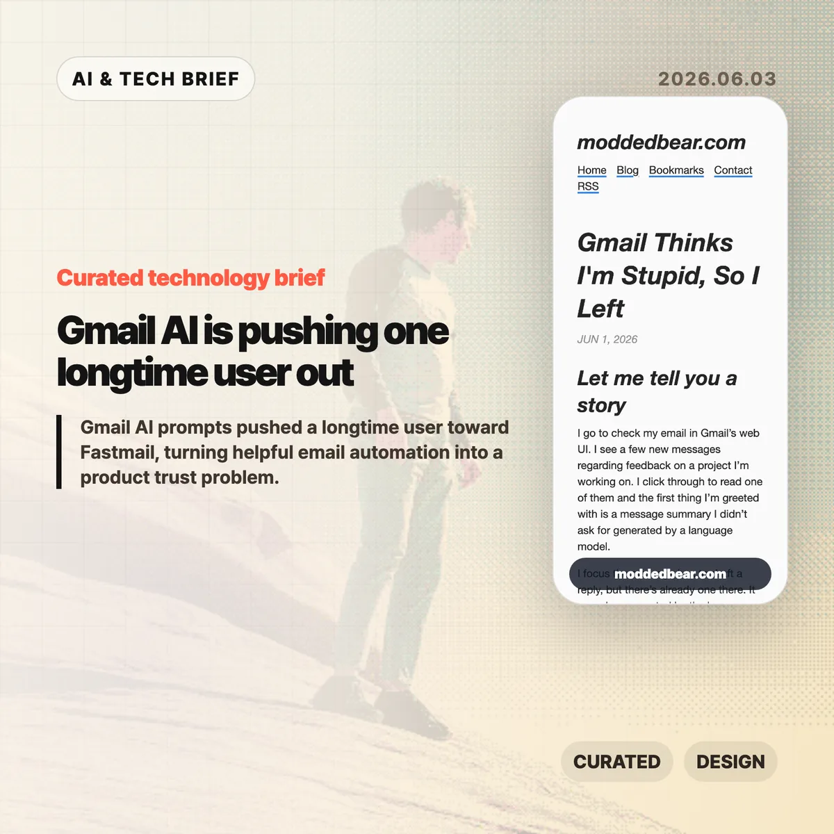
    • A longtime Gmail user says the web UI showed an unsolicited message summary, an AI-generated reply draft, a “Help me write” nudge, and a “Tab to improve” prompt while reading and writing email.
    • The author is moving toward a custom domain and Fastmail after 16 years on Gmail, partly because some unwanted smart features are hard to separate from useful older Gmail behavior.
    • The Hacker News discussion drew 399 comments and focused less on whether AI can write emails, and more on whether Google, Microsoft, and other large platforms are forcing AI into workflows to satisfy internal product metrics.
    • For product teams, Gmail AI is a useful warning: AI assistants need clear consent, easy opt-out controls, and restraint in high-trust communication tools.

    What happened

    JP’s June 1 post describes a specific Gmail web session: Gmail showed an unsolicited message summary, inserted a generated reply draft, promoted “Help me write,” and later suggested “Tab to improve.” The post says the prompts appeared while JP was reading project feedback and composing ordinary email, which made Gmail AI feel like a judgment on the user’s own reading and writing.

    The author says some Gmail AI settings can be disabled, but the controls are not cleanly separated from older Gmail features such as automatic thread categorization. That coupling matters because an off switch should not make users give up unrelated mail organization. JP’s response was to start leaving Gmail after 16 years, connect a custom domain to a mail host, try Fastmail, and set up multiple domains and aliases. The switching cost makes the story useful for product teams: email users rarely move unless irritation has become durable.

    Why Gmail AI is worth watching

    Gmail AI is worth watching because email is one of the worst places to make users feel managed by software. Reading a message, deciding tone, and writing a reply are small acts of judgment. If an AI assistant appears before the user asks for help, the product can make a competent person feel supervised rather than supported.

    The useful distinction is not AI versus no AI. Many people want summaries, drafts, translation, and tone help in email. The problem is where the assistant sits in the workflow. A visible command, a compose toolbar button, or a clearly labeled opt-in feature gives users control. A recurring prompt next to the cursor changes the mood of the tool. It turns the inbox from a communication surface into another place where the platform asks for attention.

    That is why this story travels beyond Gmail. Builders adding AI to mature products have to decide whether the assistant is a tool the user summons or a layer the company pushes across the interface. The first can save time. The second can make users wonder whose workflow the product is serving.

    What does Gmail AI change for builders?

    Gmail AI changes the product design question from “can this model help?” to “who gets interrupted, and when?” For email clients, CRMs, support desks, note apps, and developer tools, an AI writing feature touches communication, privacy, and user confidence at the same time. A weak suggestion in Gmail is not only weak text. It can make the product feel as if Google is grading the user.

    App builders should treat AI writing features like power tools. Put the assistant behind a deliberate action, keep the off switch separate from unrelated features, and avoid prompts that appear under the cursor while someone is composing. If the feature learns from user content or appears in a sensitive workflow, explain the setting in plain language. A smaller product can also compete by promising less noise: the assistant is available when asked, and quiet the rest of the time. For more IT and AI product briefs, see the IT & AI archive.

    What Hacker News readers are arguing about

    The Hacker News discussion reached roughly 642 points and 399 comments by June 3, and the argument was mostly about control. Readers treated the Gmail AI story as part of a broader platform pattern: Microsoft Copilot prompts, LinkedIn’s AI-heavy feed, Windows setup screens, Apple Intelligence, and Linux desktops all became comparison points for software that either respects or interrupts user intent.

    The strongest objection was that the same Gmail behavior is not visible to everyone. Some readers had never seen the prompts, while others pointed to Gmail settings for Smart Reply and broader smart features. That makes the story weaker as a universal Gmail diagnosis, but stronger as a rollout lesson. If account settings, Google Workspace policies, regions, or feature flags change the experience, Gmail needs clearer language about what is on, what is off, and what users lose when opting out.

    The practical thread focused on alternatives such as Fastmail, Proton Mail, Apple Mail, self-hosting, Linux desktops, and GrapheneOS. Commenters still acknowledged email switching costs, self-hosted deliverability problems, and the compromises in every provider. The frustration was less “AI is useless” and more “default software has become too needy.”

    The practical read

    Gmail AI is a product trust story before it is an AI capability story. Google may have good reasons to put Gemini-powered summaries and writing help inside Gmail, and some users will benefit from them. The risk is that email is a habit product. If the interface nags at the wrong moment, the user does not evaluate the model in isolation. He judges the whole service.

    For teams shipping AI features, the checklist is simple. Put the assistant behind a deliberate action. Keep the off switch separate from unrelated non-AI features. Avoid prompts that appear under the cursor while someone is composing. Measure repeat voluntary use, not accidental exposure. If users are moving a 16-year account because the interface feels condescending, the feature is no longer just an experiment.

    For users, the lesson is more practical: own the domain if email matters. A custom domain does not remove migration work, spam filtering problems, or provider lock-in, but it makes the next move less painful. JP’s move toward Fastmail is a reminder that switching email is still possible, especially before a provider becomes the only address people know.

    Sources

  • Dickover UX names the popups that make the web worse

    Dickover UX names the popups that make the web worse

    Dickover UX is the newly popular label for a very old irritation: a website or app covers the thing you came to read and asks you to do something else first. John Gruber coined the term in a May 29 Daring Fireball post, and the reason it landed is simple. Everyone has lost patience with cookie walls, newsletter nags, app install prompts, and fake must-click dialogs that treat attention like a hostage.

    The short version

    • A dickover is a modal, popover, or curtain that blocks content for an interaction the reader did not ask for.
    • The test is necessity: sign-in for paid content is different from a newsletter prompt that appears before the article.
    • The Hacker News thread mostly agreed with the annoyance, but argued over the business pressure and privacy-law incentives behind it.
    • Product teams should review overlays in private browsing sessions, because returning staff often never see the first-run mess new users face.
    • For more coverage of product and web design patterns, see the IT & AI archive.

    What happened

    Gruber defines a dickover as a modal panel, popover, or curtain that deliberately obscures a site’s own content to force an unwanted interaction. His examples include cookie consent panels, newsletter signups, mobile app install prompts, and terms prompts that appear before the page gives the user what they came for.

    The post is not arguing that every modal is bad. A paywall login panel can be part of the content transaction. The sharper complaint is aimed at overlays that serve the site’s secondary goals while interrupting the user’s primary task. That is why dickover UX is less a technical category than a product judgment.

    Gruber also separates dickovers from “dickbars,” his term for partial-width or edge-anchored bars that do not fully block the page. Those can still cover text, break keyboard paging, or distract the reader, but the full-screen curtain is the bigger sin because it demands dismissal before the page can be used.

    Why this is worth watching

    The useful thing about dickover UX is that it gives teams a rude but memorable name for a pattern they often normalize. Most teams do not set out to make hostile pages. They add one prompt for legal coverage, one for growth, one for email capture, one for app installs, and one for retention. The user experiences the stack, not the org chart.

    The term also catches a gap in design reviews. Teams often evaluate whether the modal works, converts, and complies. They spend less time asking whether it deserved to appear at that moment. A high-converting overlay can still teach readers that the site will interrupt them whenever it wants something.

    There is an app lesson here too. Mobile teams use notification prompts, rating prompts, permission dialogs, and install nudges in the same spirit. If the prompt appears before the user has received value, it feels like rent collection at the front door.

    What Hacker News readers are arguing about

    The Hacker News discussion was mostly sympathetic to the term. Many commenters treated it as a relief to have a word for the reflexive popups they already dismiss with Escape, browser filters, or uBlock Origin rules. Several people praised the value of naming bad patterns because a memorable label makes them easier to ridicule inside teams.

    The strongest disagreement was about incentives. One camp argued that readers are not entitled to a clean page if the site depends on ads, email capture, or other conversion mechanics. The counterargument was blunt: the browser is the user’s agent, and once a site sends a page to it, the user can filter and reshape that page locally. That split matters because it frames dickovers either as a price of access or as abuse of the reader’s machine and attention.

    Cookie consent drew the longest side debate. Some blamed European privacy regulation, while others pointed out that GDPR does not require full-screen annoyances. The more practical complaint was about malicious compliance: companies can satisfy lawyers while making rejection harder than acceptance. Commenters also noted Global Privacy Control as a better browser-level direction, though many sites still ignore it.

    The most useful operator point was simple: teams may not see their own damage. Staff, executives, and developers often accepted the cookie prompt years ago or browse from known networks, so they miss the chain of captcha, cookie wall, newsletter modal, app prompt, and checkout interruption that hits new users.

    dickover UX checklist

    A practical dickover UX review should happen before the growth experiment ships, not after complaints arrive. Run the page as a first-time visitor and watch for any prompt that blocks reading, hides the dismiss option, or asks for a commitment before the product has earned one.

    The practical read

    Treat every overlay as a small tax on trust. Before shipping one, ask five questions.

    • Is this required for the user to complete the task they started?
    • Can the user keep reading or using the page without answering now?
    • Is the dismiss action as visible as the accept action?
    • Does the prompt appear after the user has already received value?
    • Have you tested the page in a private window, on mobile, and from outside the company network?

    If the answer gets uncomfortable, the overlay probably belongs later, smaller, or nowhere. Dickover UX is a useful term because it makes a buried product tradeoff sound as ugly as it feels.

    Sources

  • LLM smells are getting easy to spot

    LLM smells are getting easy to spot

    LLM smells are the tiny tells that make AI-assisted writing or AI-built websites feel oddly familiar. A short post by Shiv After Dark put a useful name on the pattern: punchline-heavy prose, repeated sentence shapes, monospace-heavy pages, badges, cards, and step sections that keep appearing across unrelated work.

    The short version

    • LLM smells are not proof that a piece of work is bad. They are signs that the draft may still be too close to the model’s default style.
    • The clearest writing tells are punchline sentences, repeated short sentences, “X is the Y of Z” metaphors, and tidy contrast formulas.
    • The web design tells are just as visible: JetBrains Mono, step layouts, badge dots, familiar cards, and generic call-to-action buttons.
    • The useful editorial move is to treat AI output as a draft, then add concrete details, uneven human rhythm, and product-specific design choices.
    • Hacker News readers mostly pushed the argument toward code quality: AI output looks strongest when you do not yet know enough to judge it.

    What happened

    Shiv After Dark published “Various LLM smells” on May 28, 2026, after noticing that prose once polished by an LLM had started to resemble a lot of other writing on the web. The post is short, but the examples are sharp: aphoristic one-liners, strings of clipped sentences, metaphor templates, and the familiar “not merely X” style of contrast.

    The second half moves from prose to AI-generated websites. The author points to the same stack of visual habits showing up again and again: monospace typography, step sections, cards, buttons, blinking badge dots, and footnote-style flourishes. None of those choices are wrong by themselves. They become LLM smells when they arrive as a bundle, without much relationship to the product or audience.

    If you follow AI writing and web tooling, this fits a larger pattern. Models are good at producing plausible defaults. Plausible defaults are useful for a first pass. They are also easy to recognize once enough people publish them unchanged. For more English briefs on AI tooling and product craft, see the IT & AI archive.

    Why this is worth watching

    LLM smells are worth watching because they are an editing problem, not a purity test. The author is not arguing that people should stop using AI for creative work. The better reading is more practical: if a model gives you a draft in seconds, you still need to remove the model’s house style before the work feels like yours.

    For writing, that means checking whether a sentence adds information or only adds mood. Punchy lines can work, but a whole page of them starts to feel assembled. The same goes for neat metaphors. “X is the visible signature of Y” may sound elegant the first time. By the tenth version, it reads like a preset.

    For web teams, LLM smells are a useful QA category. A landing page can be clean and still generic. If the typography, cards, steps, icons, and microcopy could belong to any AI startup, the page probably needs one more design pass. App builders should pay special attention here, because store listings, onboarding screens, and extension directories reward clarity, but punish sameness.

    What Hacker News readers are arguing about

    The Hacker News discussion quickly widened from writing to competence. One of the strongest recurring points was that LLM output looks best in domains where the user is least able to judge it. That explains the split many people see in coding threads: beginners may experience the model as a dramatic productivity boost, while experienced engineers see the rework, missing context, and bad abstractions.

    Several commenters gave concrete coding examples. One described an assistant proposing a security-dangerous approach that would have bypassed a WebAssembly sandbox and executed submitted Python in the application container. Others complained about agent-generated codebases growing too large because each feature gets built in isolation: every modal is different, every button drifts, and business logic ends up scattered.

    There was a more positive camp too. Some readers said LLMs are genuinely useful for format conversions, API mappings, learning unfamiliar concepts, or getting past small obstacles. The practical distinction was not “use AI” versus “do not use AI.” It was whether the user has enough taste, tests, and domain knowledge to catch the smells before they harden into the final product.

    LLM smells checklist

    Before the final edit, look for the repeated shapes: punchline stacking, metaphor templates, tidy contrast lines, generic cards, and typography that says more about the model than the product.

    The practical read

    Use LLM smells as a checklist before publishing. In prose, look for punchline stacking, repeated short sentences, decorative metaphors, tidy contrast formulas, and abstract claims that do not name a real example. Replace them with specifics. Add the thing you actually saw, measured, built, shipped, or changed.

    In interface work, scan for the default AI landing page kit: monospace labels, gradient cards, step grids, badge dots, identical buttons, and generic hero copy. Keep the pieces that fit. Cut the ones that only make the page look “AI polished.” The goal is not to hide the tool. The goal is to make the result specific enough that the tool is no longer the most visible author.

    The same rule applies to code. AI can get you moving, especially on routine or verifiable tasks. But if you cannot review the output, you are outsourcing judgment. That is where LLM smells stop being cosmetic and start turning into maintenance work.

    Sources