Tag: User Interface

  • Trees file tree library: the UI detail dev tools keep rebuilding

    Trees file tree library: the UI detail dev tools keep rebuilding

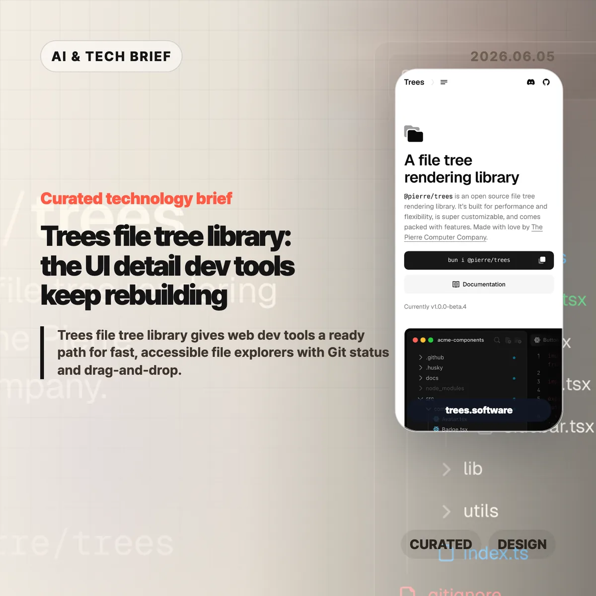
    Trees file tree library is an open source package from The Pierre Computer Co. for rendering VS Code-style file explorers on the web. The project page lists @pierre/trees as v1.0.0-beta.4, and its demo highlights automatic virtualization, Git status, drag-and-drop, search modes, ARIA tree roles, and theme control in one sidebar component.

    The short version

    • Trees is an open source file tree rendering library from The Pierre Computer Co., currently shown as v1.0.0-beta.4 on its product page.
    • The package focuses on the dull but expensive parts of developer-tool UI: flattened directory chains, Git status badges, context menus, search modes, drag-and-drop, and icon theming.
    • Its strongest technical claim is automatic virtualization. The demo says only visible rows are mounted and shows a fully expanded tree with 2,956 files.
    • Accessibility is part of the pitch, with keyboard navigation, focus management, ARIA tree roles, and WCAG 2.1 guidance called out on the source page.
    • The Hacker News submission exists, but the thread is nearly empty, so the useful questions are still coming from builders rather than commenters.

    What happened

    The Pierre Computer Co. released Trees as a web file tree rendering library under the @pierre/trees package name. The product page describes it as open source, built for performance and flexibility, and aimed at file and directory navigation inside developer tools.

    The feature set reads like a checklist from a real code editor sidebar. Trees can collapse single-child folder chains with flattenEmptyDirectories, show Git status for added, modified, deleted, renamed, untracked, and ignored files, and mark folders that contain changed descendants. It also supports custom context menus, drag-and-drop between folders or the root, and search modes that hide, collapse, or expand non-matching paths.

    That is a narrow product surface, but it is not a trivial one. A file explorer becomes infrastructure once a tool handles large repositories, AI-generated diffs, cloud workspaces, or review flows where users need to understand what changed before they trust an action.

    Why Trees file tree library is worth watching

    Trees file tree library is worth watching because The Pierre Computer Co. is treating file navigation as developer-tool infrastructure, not a throwaway sidebar. The public demo names @pierre/trees v1.0.0-beta.4, lists Git status states for added, modified, deleted, renamed, untracked, and ignored files, and shows a fully expanded 2,956-file tree with automatic virtualization.

    Those details matter for monorepos and generated projects, where rendering the whole tree can make selection and scrolling feel broken even when the data model is fine. A basic nested list is easy to build. A file tree that remains fast with thousands of entries, behaves correctly with a keyboard, shows Git state, and still fits a branded product is a different job.

    The accessibility details are also worth noting. Trees lists keyboard shortcuts for focus movement, expansion, selection, multi-select, type-ahead search, and tab focus. It also references ARIA roles such as tree and treeitem, plus aria-level, aria-posinset, and aria-setsize. Those are the details teams often postpone until a customer or internal accessibility review forces the issue.

    For more developer-tool coverage, see the IT & AI archive.

    What does Trees file tree library change for builders?

    Trees file tree library gives builders a starting point for the file explorer instead of forcing every web IDE, admin console, code review tool, or documentation product to rebuild the same sidebar. The practical gain is not only fewer lines of UI code. It is fewer hidden decisions around focus behavior, drag targets, Git decorations, search filtering, and theme integration.

    The trade-off is the usual one for a young specialized library. Trees is shown as v1.0.0-beta.4, so teams should test API stability, bundle cost, framework fit, and edge cases before committing it to a core workflow. The package looks strongest for products already close to the Pierre ecosystem or for teams that need a polished file tree quickly and would otherwise spend weeks on details users only notice when they fail.

    There is also an AI-adjacent reason this category is getting more important. Coding agents change files quickly. Humans still need a readable map of what changed, which files matter, and which folders hide work in progress. A fast file tree will not make an AI coding tool safer by itself, but it gives review and navigation screens a better base.

    What Hacker News readers are arguing about

    The Hacker News submission for Trees exists, but it has almost no discussion at the time of writing. That absence is useful in its own way: the project has a clear product demo, yet the public technical debate has not caught up.

    The questions worth asking are the ones a longer thread would likely surface. How stable is the API while the package is still beta? How well does virtualization behave with variable row heights, custom icons, and nested drag targets? Can the accessibility model hold up once a product adds multi-select, rename fields, context menus, and async file loading? And for teams outside the Pierre stack, how much styling and state management do they need to own themselves?

    So the discussion is not evidence of broad adoption yet. Treat it as an early signal for a common developer-tool problem: file navigation is easy to underestimate, and the cost shows up late.

    The practical read

    Use Trees as a reference point when a product needs a browser-based IDE, code review surface, repo browser, AI coding dashboard, or cloud console with a real file explorer. The concrete benchmark to copy is not visual polish; it is the combination of v1.0.0-beta.4 features: visible-row virtualization, 2,956-file demo scale, Git status badges, drag-and-drop controls, search modes, keyboard shortcuts, ARIA roles, and CSS/Shiki theming.

    Test it with your worst repository, not a toy example. Expand everything, search across paths, move folders, try keyboard-only navigation, turn on Git status, switch themes, and run it through a screen reader pass. If those tests hold, Trees can save real UI time. If they fail, the failure will still tell you which parts of your file tree spec were missing.

    The safest bet is to treat Trees as product infrastructure, not decoration. File trees sit between the user’s mental model and the codebase. When that layer is slow or confusing, the rest of the tool feels less trustworthy.

    Sources

  • EV user interface design is making cars harder to drive

    EV user interface design is making cars harder to drive

    EV user interface design has a strange habit right now: it keeps taking simple car controls and turning them into software problems. John Siracusa’s “EV Stupidity Checklist” argues that flush door handles, screen-only climate controls, electronic charge-port doors, and camera replacements for mirrors often make cars feel newer while making them worse at being cars.

    The short version

    • Siracusa’s checklist is less an anti-EV rant than a product design audit: if a driver needs to look at a screen for a frequent action, the design probably failed.
    • The useful line is between optional software enhancement and replacement. Cameras, sensors, and screens can help, but they should not remove obvious physical controls for doors, mirrors, climate, or turn signals.
    • Hacker News readers mostly agreed on tactile controls and door-handle affordances, then argued over cameras. The strongest defense of cameras was for reversing and parking, not for deleting mirrors or rear windows.
    • The practical lesson for builders is simple: interface minimalism gets expensive when the user is moving, distracted, cold, wet, injured, or in a hurry.

    What happened

    John Siracusa published a checklist for modern car designers after watching EV makers replace long-settled car controls with electronic or screen-based versions. The list calls out accessible exterior door handles, physical door releases, obvious affordances, a real turn-signal stalk, tactile steering-wheel buttons, physical climate controls, physical air-flow direction, a physical glove-box release, real mirrors, a rear window when the vehicle shape allows it, and side-view mirrors.

    The piece starts from a fair point. When Tesla pushed EVs into the mainstream, futuristic design helped sell the category. Flush handles and giant center screens made the cars look different from gasoline vehicles. But Siracusa argues that this phase should be over. In 2026, EV makers do not need to prove that electric cars are futuristic by making door handles less obvious or climate controls harder to use.

    Cost is the less flattering reason. A big touchscreen can replace a pile of switches, knobs, and small displays. That saves parts and gives automakers more room to ship software changes later. It also moves interaction cost onto the driver. A temperature knob can be found by touch. A menu item cannot.

    EV user interface design in the real world

    This is the awkward part for car companies: many of these changes are easy to sell in a showroom and annoying after six months of ownership. The interface looks clean when the car is parked. It feels worse when the driver needs to change the fan speed without taking their eyes off traffic.

    Why this is worth watching

    The article lands because it treats EV user interface design as a human-factors problem, not a nostalgia fight. Physical controls survived in cars because driving is a hostile context for interaction design. The user is busy. The user’s eyes should be on the road. The car may be moving fast. Weather, gloves, passengers, stress, and emergencies all make clever interfaces worse.

    That is why the door-handle examples matter. A flush handle may improve the side profile of a car, and automakers often mention aerodynamics. Siracusa’s objection is that a door-opening mechanism should be obvious to a stranger and usable before any sensor, motor, battery, or software state participates. In a crash or power failure, that distinction stops being aesthetic.

    The same logic applies inside the car. A fixed climate strip on a touchscreen is still a flat piece of glass. It does not give the hand a shape, edge, detent, or muscle-memory target. For more product and technology context like this, the IT & AI archive is the right place to browse related briefs.

    What Hacker News readers are arguing about

    The Hacker News thread mostly accepted the checklist’s complaint about carmakers replacing proven controls with fragile ones. Several readers pointed to retractable handles and electronic releases as a safety issue rather than a style preference. One commenter noted that China has reportedly moved to restrict retractable exterior handles and purely electrical interior handles after incidents where occupants could not get out or rescuers could not get in.

    The more interesting fight was about cameras. Some readers argued that rear-view cameras are plainly better for backing up because they show what mirrors cannot, including children or objects directly behind the car. That is a strong point, but it is narrower than the checklist’s claim. Siracusa is not arguing against backup cameras as an aid. He is arguing against replacing mirrors and rear windows with screens.

    The best objection from the mirror side was practical, not sentimental. Screens have focal-distance issues, limited dynamic range, glare and brightness problems, dirt and salt on lenses, software or electrical failure modes, and weaker depth cues. Several drivers said the best setup is both: mirrors for continuous spatial awareness, cameras for low-speed backing and parking.

    There was also a product-management thread under the jokes. Readers kept circling back to the same explanation: automakers know how to build usable controls, but they keep choosing cheaper or more visually distinctive designs. That makes the problem harder to dismiss as a temporary learning curve.

    The practical read

    If you design a car, do not make basic actions depend on a screen unless the screen is only an extra path. Door opening, signaling, climate adjustment, hazard lights, glove-box access, mirror checks, and charging access need fast physical affordances. They should work for a new user, in bad weather, under stress, and after a partial system failure.

    If you design software, the lesson is still useful. EV user interface design is a reminder that lower visual complexity can raise operational complexity. A clean surface is not the same as a usable surface. The more urgent or physical the task, the more the interface needs shape, location, feedback, and fallback behavior.

    The checklist is blunt, and some items will annoy designers who like radical interiors. That is partly why it works. It gives product teams a test that is hard to dodge: can the user do the thing quickly without looking, guessing, or waiting for a system to wake up? If the answer is no, the interface probably looks smarter than it drives.

    Sources