Modern pixel fonts are getting interesting again because the better ones are not simple retro props. They keep the texture of old screens while fixing the parts that made those screens hard to read: weak metrics, awkward baselines, brittle scaling, and decorative-only glyph sets.
Table of Contents
The short version
- Marcin Wichary’s note points to Analog Mono, Coral Pixels, Two Slice, and Vercel’s Geist Pixel as examples of pixel-inspired type made for current systems.
- The useful pattern is constraint with cleanup: keep the low-resolution character, but make baseline, spacing, glyph coverage, and rendering work in real interfaces.
- Modern pixel fonts are safest in short, high-personality surfaces such as badges, landing page headers, game-like UI, status labels, and product moments.
- The Hacker News thread was enthusiastic about the fonts, but skeptical of the marketing language around them.
What happened with modern pixel fonts
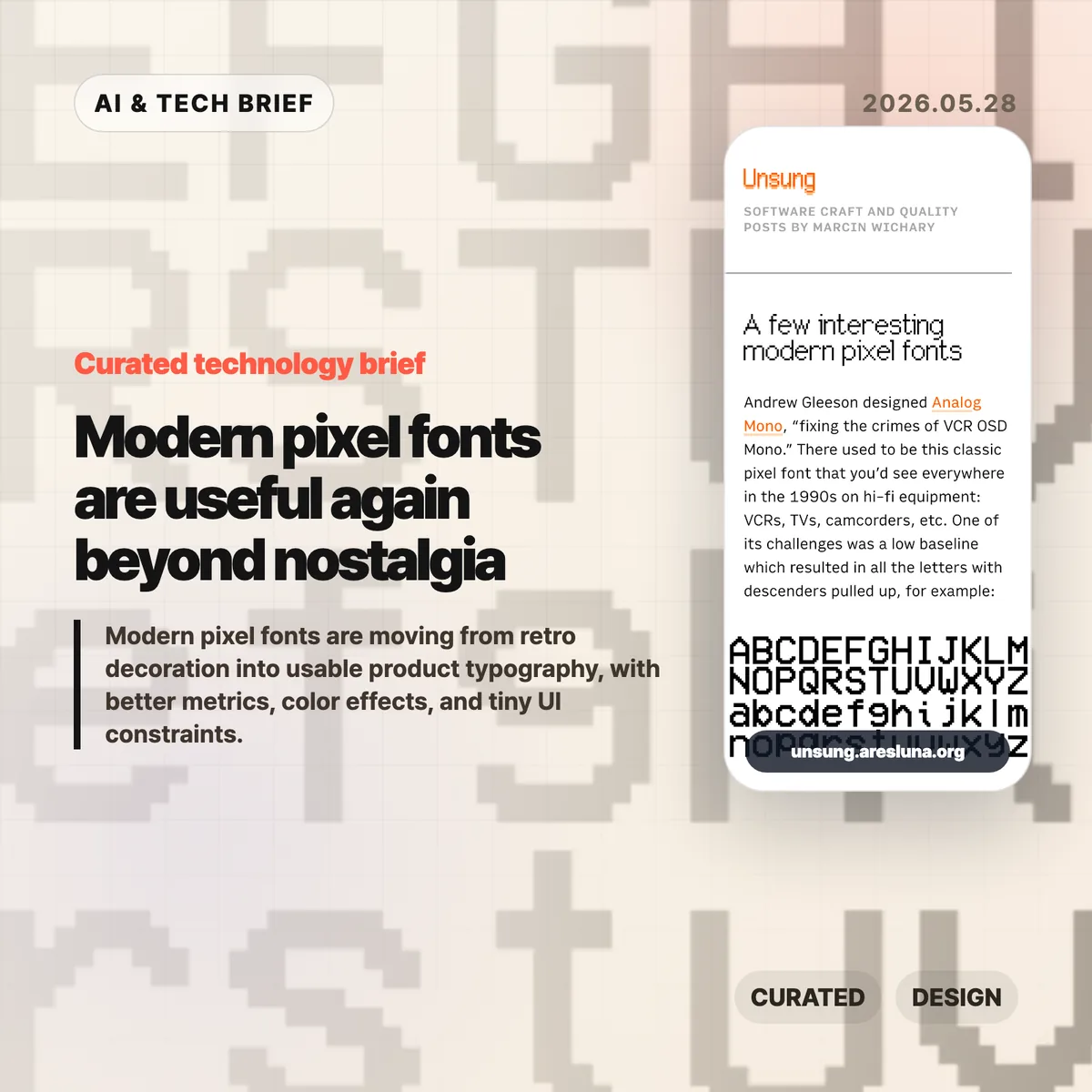
Marcin Wichary collected a few recent pixel-style fonts that show how the category has changed. Analog Mono by Andrew Gleeson revisits the VCR OSD Mono look from 1990s consumer electronics, but fixes the low baseline issue that pulled descenders into awkward positions. Coral Pixels by Kumiko Yoshida turns old subpixel color fringing into a deliberate font effect. Two Slice by Joseph Fatula pushes the constraint further: it is only two pixels tall and still somewhat readable.
The last example, Vercel’s Geist Pixel, makes the product-design point most clearly. Its pitch argues that pixel fonts often fail in production because they do not scale cleanly, their vertical metrics fight the rest of the type system, or they only work as decoration. Strip away the launch-copy gloss and the problem is real. A font can look charming in a specimen and still be annoying in a UI if the spacing, metadata, fallback behavior, and glyph coverage are weak.
For readers who follow product design and developer tools, this sits neatly beside the broader IT & AI archive: small interface details keep becoming product identity. Typography is one of the cheapest details to change, and one of the easiest to misuse.
Why this is worth watching
The interesting part is not nostalgia by itself. Designers have been borrowing from old terminals, arcade cabinets, handhelds, and VCR overlays for years. The shift is that some modern pixel fonts are built like usable type, not screenshots of a mood board.
That matters for web and app teams. A pixel font used as a logo, chip, scoreboard, command label, or onboarding accent can make a product feel less generic. Used across body copy, it usually becomes a punishment. The better question is where the constraint helps the interface say something quickly.
Coral Pixels is a good example of the tradeoff. Subpixel fringing was originally a rendering artifact. Some people remember it as ugly eye strain; others read it as a strong memory of early LCDs and Windows-era text. As a color font, that artifact becomes a controlled style rather than an accidental blur. That does not make it broadly readable. It does make it useful in short bursts.
What Hacker News readers are arguing about
The Hacker News discussion is mostly a mix of font recommendations, nostalgia, and irritation at product marketing. Several readers liked Geist Pixel, Analog Mono, or Two Slice, while others used the thread to trade older favorites such as Topaz, Unscii, Departure Mono, 04b-03, Sans Nouveaux, and other low-resolution typefaces.
The sharpest disagreement was around Coral Pixels. One camp found the color fringing hard to justify because subpixel rendering was meant to make text sharper, not more colorful. Another camp pushed back that many people did experience smeary, colored edges on older or poorly configured displays, which is exactly why the look can now trigger nostalgia.
The most useful criticism was about Vercel’s copy for Geist Pixel. Commenters mocked phrases like “system extension” because they sound inflated. That skepticism is fair, but it also points to the real production issue: a pixel font only earns its place if it behaves well inside a type system. Letterforms are the visible part. Metrics, kerning, glyph coverage, and vertical alignment decide whether it survives contact with a real product.
The practical read
Treat modern pixel fonts like hot sauce. A little can make a product memorable. Too much makes everything harder to read.
For a practical test, set the font in the exact surface where it will ship: a button, badge, hero word, scoreboard number, modal title, app-store screenshot, or game-like status line. Check it at mobile size, desktop size, light mode, dark mode, and one fallback font. If the personality disappears without the specimen page, the font was probably doing decorative work that your product cannot support.
For app builders, the ASO angle is straightforward: distinctive type can help a screenshot or feature card stand out, but store assets punish low readability. Use the pixel voice for a short label or scene-setting word, then let a normal text face carry the explanation.