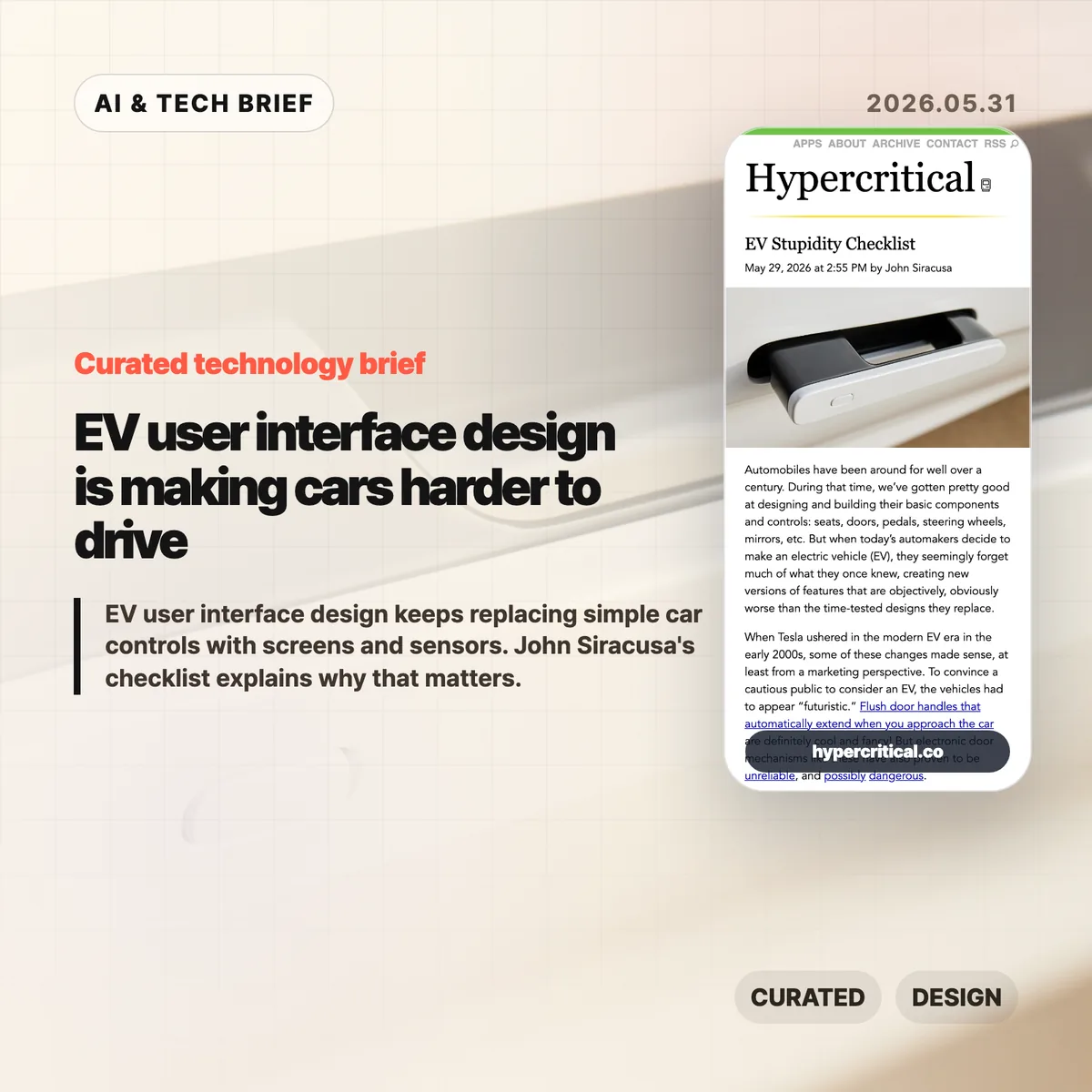
EV user interface design has a strange habit right now: it keeps taking simple car controls and turning them into software problems. John Siracusa’s “EV Stupidity Checklist” argues that flush door handles, screen-only climate controls, electronic charge-port doors, and camera replacements for mirrors often make cars feel newer while making them worse at being cars.
Table of Contents
The short version
- Siracusa’s checklist is less an anti-EV rant than a product design audit: if a driver needs to look at a screen for a frequent action, the design probably failed.
- The useful line is between optional software enhancement and replacement. Cameras, sensors, and screens can help, but they should not remove obvious physical controls for doors, mirrors, climate, or turn signals.
- Hacker News readers mostly agreed on tactile controls and door-handle affordances, then argued over cameras. The strongest defense of cameras was for reversing and parking, not for deleting mirrors or rear windows.
- The practical lesson for builders is simple: interface minimalism gets expensive when the user is moving, distracted, cold, wet, injured, or in a hurry.
What happened
John Siracusa published a checklist for modern car designers after watching EV makers replace long-settled car controls with electronic or screen-based versions. The list calls out accessible exterior door handles, physical door releases, obvious affordances, a real turn-signal stalk, tactile steering-wheel buttons, physical climate controls, physical air-flow direction, a physical glove-box release, real mirrors, a rear window when the vehicle shape allows it, and side-view mirrors.
The piece starts from a fair point. When Tesla pushed EVs into the mainstream, futuristic design helped sell the category. Flush handles and giant center screens made the cars look different from gasoline vehicles. But Siracusa argues that this phase should be over. In 2026, EV makers do not need to prove that electric cars are futuristic by making door handles less obvious or climate controls harder to use.
Cost is the less flattering reason. A big touchscreen can replace a pile of switches, knobs, and small displays. That saves parts and gives automakers more room to ship software changes later. It also moves interaction cost onto the driver. A temperature knob can be found by touch. A menu item cannot.
EV user interface design in the real world
This is the awkward part for car companies: many of these changes are easy to sell in a showroom and annoying after six months of ownership. The interface looks clean when the car is parked. It feels worse when the driver needs to change the fan speed without taking their eyes off traffic.
Why this is worth watching
The article lands because it treats EV user interface design as a human-factors problem, not a nostalgia fight. Physical controls survived in cars because driving is a hostile context for interaction design. The user is busy. The user’s eyes should be on the road. The car may be moving fast. Weather, gloves, passengers, stress, and emergencies all make clever interfaces worse.
That is why the door-handle examples matter. A flush handle may improve the side profile of a car, and automakers often mention aerodynamics. Siracusa’s objection is that a door-opening mechanism should be obvious to a stranger and usable before any sensor, motor, battery, or software state participates. In a crash or power failure, that distinction stops being aesthetic.
The same logic applies inside the car. A fixed climate strip on a touchscreen is still a flat piece of glass. It does not give the hand a shape, edge, detent, or muscle-memory target. For more product and technology context like this, the IT & AI archive is the right place to browse related briefs.
What Hacker News readers are arguing about
The Hacker News thread mostly accepted the checklist’s complaint about carmakers replacing proven controls with fragile ones. Several readers pointed to retractable handles and electronic releases as a safety issue rather than a style preference. One commenter noted that China has reportedly moved to restrict retractable exterior handles and purely electrical interior handles after incidents where occupants could not get out or rescuers could not get in.
The more interesting fight was about cameras. Some readers argued that rear-view cameras are plainly better for backing up because they show what mirrors cannot, including children or objects directly behind the car. That is a strong point, but it is narrower than the checklist’s claim. Siracusa is not arguing against backup cameras as an aid. He is arguing against replacing mirrors and rear windows with screens.
The best objection from the mirror side was practical, not sentimental. Screens have focal-distance issues, limited dynamic range, glare and brightness problems, dirt and salt on lenses, software or electrical failure modes, and weaker depth cues. Several drivers said the best setup is both: mirrors for continuous spatial awareness, cameras for low-speed backing and parking.
There was also a product-management thread under the jokes. Readers kept circling back to the same explanation: automakers know how to build usable controls, but they keep choosing cheaper or more visually distinctive designs. That makes the problem harder to dismiss as a temporary learning curve.
The practical read
If you design a car, do not make basic actions depend on a screen unless the screen is only an extra path. Door opening, signaling, climate adjustment, hazard lights, glove-box access, mirror checks, and charging access need fast physical affordances. They should work for a new user, in bad weather, under stress, and after a partial system failure.
If you design software, the lesson is still useful. EV user interface design is a reminder that lower visual complexity can raise operational complexity. A clean surface is not the same as a usable surface. The more urgent or physical the task, the more the interface needs shape, location, feedback, and fallback behavior.
The checklist is blunt, and some items will annoy designers who like radical interiors. That is partly why it works. It gives product teams a test that is hard to dodge: can the user do the thing quickly without looking, guessing, or waiting for a system to wake up? If the answer is no, the interface probably looks smarter than it drives.