Tag: Product Design

  • Staff Product Designer Is a Scope Change, Not a Promotion

    Staff Product Designer Is a Scope Change, Not a Promotion

    A Staff Product Designer is a product design leader whose scope reaches beyond one feature team. In Verified Insider’s June 2026 Q&A, the role is defined by cross-team judgment: deciding whether a feature, product area, or team direction makes sense before the organization spends weeks making it polished.

    The short version

    • A Staff Product Designer is measured by cross-team product impact, not by years of experience or a louder title.
    • Verified Insider’s June 2026 Q&A names three contributors, Milan Jovanovic, Mo Elmelegy, and Rachel Wu, to explain how staff-level design differs from senior IC work.
    • Senior designers usually raise the quality of a feature, flow, or product area; staff-level designers connect problems across teams and shape product direction.
    • AI prototyping tools make execution faster, so staff-level designers become more valuable when they filter which ideas deserve time.
    • The strongest career signal is trust: other teams invite the designer into unclear decisions before the title arrives.

    What happened

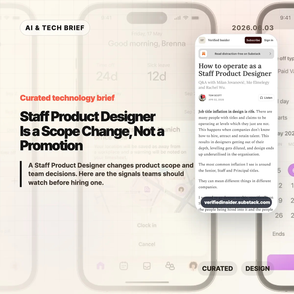
    Verified Insider published a Q&A on how to operate as a Staff Product Designer, featuring Milan Jovanovic, Mo Elmelegy, and Rachel Wu. The piece starts from a familiar problem in design hiring: seniority labels have stretched so far that Senior, Staff, and Principal can mean different things from one company to the next.

    The cleanest distinction in the article is scope. A Senior Product Designer is usually accountable for strong work inside a feature, flow, or product area. A Staff Product Designer works across those boundaries. That can mean aligning teams, making trade-offs clearer, mapping repeated product problems, or helping leaders understand why one direction deserves attention over another.

    That distinction matters for startups and product teams because titles often arrive late. The article argues that designers who become staff-level contributors often start doing the work before the promotion. They open up their process, explain the choices they rejected, build trust outside their immediate team, and become the person others call when the problem is still fuzzy.

    Why Staff Product Designer is worth watching

    The Staff Product Designer role is worth watching because AI is lowering the cost of making product artifacts while raising the cost of poor judgment. A team can now generate mockups, prototypes, and code-like experiments faster than it could a few years ago. Speed does not answer whether the work maps to a customer problem, business goal, or product strategy.

    That is where staff-level design becomes more visible. The job is less about producing more screens and more about improving the quality of decisions around those screens. Milan Jovanovic describes designing conversations and meetings alongside layouts and buttons. That line is useful because it removes some of the mystique from the role. Staff design work often looks like structure: clearer framing, better options, fewer duplicate efforts, and a shared language between design, product, engineering, and leadership.

    For more coverage of how AI and product teams are changing together, see the IT & AI archive.

    What does a Staff Product Designer change for builders?

    A Staff Product Designer changes the selection process for product work. For builders, the best signal is whether the designer can spot when three teams are solving the same onboarding problem in incompatible ways, then turn that mess into a shared product pattern.

    This matters more in AI-heavy workflows because the prototype is no longer the hard part by default. Cursor, Figma AI features, and other tools can help teams explore more directions. The bottleneck moves to judgment: which direction fits the company’s current goal, what trade-off is acceptable, which user problem is real, and which idea is only exciting because it is easy to build.

    A good staff-level designer helps the team pause without slowing it down. They translate ambiguity into choices that PMs, engineers, growth teams, and executives can debate without getting lost in design language.

    How can designers grow into the role?

    Designers grow into a Staff Product Designer role by expanding the surface area of their decisions before they ask for the title. The practical move is to stop presenting only the finished screen. Show why one direction won, which options were rejected, what risk remains, and what evidence would change the decision.

    The second move is to leave the comfort of the immediate product squad. Talk to support, sales, growth, engineering leads, and other product teams. Many staff-level problems appear as repeated friction across the organization: inconsistent onboarding, separate teams rebuilding the same pattern, mobile and desktop experiences making different promises, or leadership debates that never become clear product principles.

    The third move is to build credibility without positional authority. Staff designers often influence people they do not manage. That requires sharper writing, calmer facilitation, and a habit of turning ambiguous arguments into visible trade-offs.

    What the discussion is missing

    There does not appear to be a public Hacker News discussion for this article, so the useful missing debate is how companies should evaluate staff-level design without turning it into another vague title. The article gives a strong qualitative frame, but hiring managers still need observable signals.

    Three signals are worth testing in interviews and promotion reviews. First, can the designer explain a time they changed the definition of a problem, not only the quality of the final interface? Second, can they show influence across teams without relying on formal authority? Third, can they connect design decisions to activation, retention, revenue, risk, or another business metric without pretending design owns the whole outcome?

    The caution is that companies can misuse the title as a prestige badge. If the role has no mandate to work across teams, no access to strategic conversations, and no expectation to shape product direction, it is probably a senior IC role with a louder title.

    The practical read

    Treat Staff Product Designer as an operating mode before you treat it as a career ladder step. For a 2026 product team, the hiring brief should name the cross-team product problems that need design leadership, the leaders who must be influenced, and the decisions the person should improve in the first six months.

    If you are a designer aiming for the level, audit where your impact currently stops. Look for the meeting where your work loses context, the team that recreates a pattern you already solved, or the product decision that would improve if the trade-offs were visible earlier. That is usually where staff-level work begins.

    AI does not make this role obsolete. It makes the judgment layer easier to see. When teams can build more ideas, the designer who helps them choose better ideas becomes more valuable.

    Sources

  • Dickover UX names the popups that make the web worse

    Dickover UX names the popups that make the web worse

    Dickover UX is the newly popular label for a very old irritation: a website or app covers the thing you came to read and asks you to do something else first. John Gruber coined the term in a May 29 Daring Fireball post, and the reason it landed is simple. Everyone has lost patience with cookie walls, newsletter nags, app install prompts, and fake must-click dialogs that treat attention like a hostage.

    The short version

    • A dickover is a modal, popover, or curtain that blocks content for an interaction the reader did not ask for.
    • The test is necessity: sign-in for paid content is different from a newsletter prompt that appears before the article.
    • The Hacker News thread mostly agreed with the annoyance, but argued over the business pressure and privacy-law incentives behind it.
    • Product teams should review overlays in private browsing sessions, because returning staff often never see the first-run mess new users face.
    • For more coverage of product and web design patterns, see the IT & AI archive.

    What happened

    Gruber defines a dickover as a modal panel, popover, or curtain that deliberately obscures a site’s own content to force an unwanted interaction. His examples include cookie consent panels, newsletter signups, mobile app install prompts, and terms prompts that appear before the page gives the user what they came for.

    The post is not arguing that every modal is bad. A paywall login panel can be part of the content transaction. The sharper complaint is aimed at overlays that serve the site’s secondary goals while interrupting the user’s primary task. That is why dickover UX is less a technical category than a product judgment.

    Gruber also separates dickovers from “dickbars,” his term for partial-width or edge-anchored bars that do not fully block the page. Those can still cover text, break keyboard paging, or distract the reader, but the full-screen curtain is the bigger sin because it demands dismissal before the page can be used.

    Why this is worth watching

    The useful thing about dickover UX is that it gives teams a rude but memorable name for a pattern they often normalize. Most teams do not set out to make hostile pages. They add one prompt for legal coverage, one for growth, one for email capture, one for app installs, and one for retention. The user experiences the stack, not the org chart.

    The term also catches a gap in design reviews. Teams often evaluate whether the modal works, converts, and complies. They spend less time asking whether it deserved to appear at that moment. A high-converting overlay can still teach readers that the site will interrupt them whenever it wants something.

    There is an app lesson here too. Mobile teams use notification prompts, rating prompts, permission dialogs, and install nudges in the same spirit. If the prompt appears before the user has received value, it feels like rent collection at the front door.

    What Hacker News readers are arguing about

    The Hacker News discussion was mostly sympathetic to the term. Many commenters treated it as a relief to have a word for the reflexive popups they already dismiss with Escape, browser filters, or uBlock Origin rules. Several people praised the value of naming bad patterns because a memorable label makes them easier to ridicule inside teams.

    The strongest disagreement was about incentives. One camp argued that readers are not entitled to a clean page if the site depends on ads, email capture, or other conversion mechanics. The counterargument was blunt: the browser is the user’s agent, and once a site sends a page to it, the user can filter and reshape that page locally. That split matters because it frames dickovers either as a price of access or as abuse of the reader’s machine and attention.

    Cookie consent drew the longest side debate. Some blamed European privacy regulation, while others pointed out that GDPR does not require full-screen annoyances. The more practical complaint was about malicious compliance: companies can satisfy lawyers while making rejection harder than acceptance. Commenters also noted Global Privacy Control as a better browser-level direction, though many sites still ignore it.

    The most useful operator point was simple: teams may not see their own damage. Staff, executives, and developers often accepted the cookie prompt years ago or browse from known networks, so they miss the chain of captcha, cookie wall, newsletter modal, app prompt, and checkout interruption that hits new users.

    dickover UX checklist

    A practical dickover UX review should happen before the growth experiment ships, not after complaints arrive. Run the page as a first-time visitor and watch for any prompt that blocks reading, hides the dismiss option, or asks for a commitment before the product has earned one.

    The practical read

    Treat every overlay as a small tax on trust. Before shipping one, ask five questions.

    • Is this required for the user to complete the task they started?
    • Can the user keep reading or using the page without answering now?
    • Is the dismiss action as visible as the accept action?
    • Does the prompt appear after the user has already received value?
    • Have you tested the page in a private window, on mobile, and from outside the company network?

    If the answer gets uncomfortable, the overlay probably belongs later, smaller, or nowhere. Dickover UX is a useful term because it makes a buried product tradeoff sound as ugly as it feels.

    Sources

  • EV user interface design is making cars harder to drive

    EV user interface design is making cars harder to drive

    EV user interface design has a strange habit right now: it keeps taking simple car controls and turning them into software problems. John Siracusa’s “EV Stupidity Checklist” argues that flush door handles, screen-only climate controls, electronic charge-port doors, and camera replacements for mirrors often make cars feel newer while making them worse at being cars.

    The short version

    • Siracusa’s checklist is less an anti-EV rant than a product design audit: if a driver needs to look at a screen for a frequent action, the design probably failed.
    • The useful line is between optional software enhancement and replacement. Cameras, sensors, and screens can help, but they should not remove obvious physical controls for doors, mirrors, climate, or turn signals.
    • Hacker News readers mostly agreed on tactile controls and door-handle affordances, then argued over cameras. The strongest defense of cameras was for reversing and parking, not for deleting mirrors or rear windows.
    • The practical lesson for builders is simple: interface minimalism gets expensive when the user is moving, distracted, cold, wet, injured, or in a hurry.

    What happened

    John Siracusa published a checklist for modern car designers after watching EV makers replace long-settled car controls with electronic or screen-based versions. The list calls out accessible exterior door handles, physical door releases, obvious affordances, a real turn-signal stalk, tactile steering-wheel buttons, physical climate controls, physical air-flow direction, a physical glove-box release, real mirrors, a rear window when the vehicle shape allows it, and side-view mirrors.

    The piece starts from a fair point. When Tesla pushed EVs into the mainstream, futuristic design helped sell the category. Flush handles and giant center screens made the cars look different from gasoline vehicles. But Siracusa argues that this phase should be over. In 2026, EV makers do not need to prove that electric cars are futuristic by making door handles less obvious or climate controls harder to use.

    Cost is the less flattering reason. A big touchscreen can replace a pile of switches, knobs, and small displays. That saves parts and gives automakers more room to ship software changes later. It also moves interaction cost onto the driver. A temperature knob can be found by touch. A menu item cannot.

    EV user interface design in the real world

    This is the awkward part for car companies: many of these changes are easy to sell in a showroom and annoying after six months of ownership. The interface looks clean when the car is parked. It feels worse when the driver needs to change the fan speed without taking their eyes off traffic.

    Why this is worth watching

    The article lands because it treats EV user interface design as a human-factors problem, not a nostalgia fight. Physical controls survived in cars because driving is a hostile context for interaction design. The user is busy. The user’s eyes should be on the road. The car may be moving fast. Weather, gloves, passengers, stress, and emergencies all make clever interfaces worse.

    That is why the door-handle examples matter. A flush handle may improve the side profile of a car, and automakers often mention aerodynamics. Siracusa’s objection is that a door-opening mechanism should be obvious to a stranger and usable before any sensor, motor, battery, or software state participates. In a crash or power failure, that distinction stops being aesthetic.

    The same logic applies inside the car. A fixed climate strip on a touchscreen is still a flat piece of glass. It does not give the hand a shape, edge, detent, or muscle-memory target. For more product and technology context like this, the IT & AI archive is the right place to browse related briefs.

    What Hacker News readers are arguing about

    The Hacker News thread mostly accepted the checklist’s complaint about carmakers replacing proven controls with fragile ones. Several readers pointed to retractable handles and electronic releases as a safety issue rather than a style preference. One commenter noted that China has reportedly moved to restrict retractable exterior handles and purely electrical interior handles after incidents where occupants could not get out or rescuers could not get in.

    The more interesting fight was about cameras. Some readers argued that rear-view cameras are plainly better for backing up because they show what mirrors cannot, including children or objects directly behind the car. That is a strong point, but it is narrower than the checklist’s claim. Siracusa is not arguing against backup cameras as an aid. He is arguing against replacing mirrors and rear windows with screens.

    The best objection from the mirror side was practical, not sentimental. Screens have focal-distance issues, limited dynamic range, glare and brightness problems, dirt and salt on lenses, software or electrical failure modes, and weaker depth cues. Several drivers said the best setup is both: mirrors for continuous spatial awareness, cameras for low-speed backing and parking.

    There was also a product-management thread under the jokes. Readers kept circling back to the same explanation: automakers know how to build usable controls, but they keep choosing cheaper or more visually distinctive designs. That makes the problem harder to dismiss as a temporary learning curve.

    The practical read

    If you design a car, do not make basic actions depend on a screen unless the screen is only an extra path. Door opening, signaling, climate adjustment, hazard lights, glove-box access, mirror checks, and charging access need fast physical affordances. They should work for a new user, in bad weather, under stress, and after a partial system failure.

    If you design software, the lesson is still useful. EV user interface design is a reminder that lower visual complexity can raise operational complexity. A clean surface is not the same as a usable surface. The more urgent or physical the task, the more the interface needs shape, location, feedback, and fallback behavior.

    The checklist is blunt, and some items will annoy designers who like radical interiors. That is partly why it works. It gives product teams a test that is hard to dodge: can the user do the thing quickly without looking, guessing, or waiting for a system to wake up? If the answer is no, the interface probably looks smarter than it drives.

    Sources

  • Figma design agent moves AI into the canvas

    Figma design agent moves AI into the canvas

    Figma design agent is Figma’s new beta assistant that works directly on the design canvas. The useful part is not that it can produce more mockups. It can read the working file, use team components and tokens, summarize feedback, and stay inside the place where designers already make decisions.

    The short version

    • Figma is rolling out a beta design agent inside Figma Design, available from the canvas and left rail.
    • The agent can use components, tokens, variables, libraries, file context, and comments rather than starting from a blank prompt.
    • Figma positions the agent for exploration, bulk edits, design system maintenance, and feedback cleanup.
    • The company separates the Figma design agent from Figma MCP: the agent works in the canvas, while MCP connects code and Figma workflows.
    • The beta is planned for Full seat users on Professional, Organization, and Enterprise plans, with Collab and Dev seats limited to drafts.

    What happened

    Figma announced the Figma design agent as a beta feature built into Figma Design. It appears on the canvas and in the left rail, so a designer can ask for changes without moving to a separate AI tool or exporting work elsewhere.

    The product pitch is fairly specific. Figma says the agent has extra context about a team’s design system, including components, tokens, standards, recent component usage, variables, and libraries. That matters because generic image or UI generators often miss the rules that make a product feel like itself.

    Figma also draws a line between the agent and its MCP work. The Figma MCP server is for moving between code and Figma, including code-to-canvas and design-to-code workflows. The Figma design agent is for work that happens in the file: generating design layers, trying variants, applying systems, changing content, and turning feedback into tasks.

    Why this is worth watching

    The Figma design agent is interesting because it aims at the messy middle of product design. Many AI design demos stop at a polished first screen. Real teams spend more time comparing options, naming variables, swapping components, rewriting copy, handling dark mode, and making sense of review comments.

    That is where Figma’s approach could be useful. If the agent can safely handle bulk edits and design system chores, it saves time without pretending that taste has been automated. If it can summarize comments and turn them into next steps, it can reduce the lag between critique and revision.

    There is still a quality trap. More variants can mean more mediocre options. Figma’s own post admits that once a direction is clear, hands-on editing is often faster and more natural than continuing to prompt. That is the right framing. The agent looks more credible as a design operations helper than as a replacement for judgment.

    For readers who track product and AI tooling, this also fits a broader shift covered in our IT & AI archive: AI features are moving into the main workspace rather than asking teams to adopt a new destination app.

    What the discussion is missing

    I did not find a reliable Hacker News thread for this specific Figma announcement. The questions worth asking are still clear.

    First, product teams should watch how much control designers keep when the agent edits real files. Bulk changes sound useful, but a bad edit across dozens of frames can create cleanup work fast. Version history, review habits, and scoped prompts will matter.

    Second, design system teams should test the boring cases before the impressive ones. Renaming variables, documenting component variants, replacing repeated UI elements, and converting screens to dark mode will reveal whether the agent understands the system or merely imitates it.

    Third, the seat and plan limits matter for adoption. During beta, Figma says the agent will not consume credits. At general availability, AI credits will apply. That pricing detail could decide whether teams treat the feature as a daily helper or a limited experiment.

    The practical read for the Figma design agent

    If your team already works heavily in Figma, the Figma design agent is worth testing on contained work first. Try comment summaries, bulk component swaps, copy population, dark mode conversion, and design system documentation before asking it to invent a product direction.

    For designers, the safest posture is to use the agent to widen the search and clear repetitive tasks, then make the final calls by hand. For design system owners, the first win may be maintenance: descriptions, tags, states, variants, and naming rules. For app builders, the ASO angle is simple enough: faster UI exploration can help teams compare onboarding, checkout, and feature-discovery flows before they reach the app store.

    The main thing to avoid is treating canvas-native AI as a quality guarantee. It is closer to a junior collaborator with unusually broad file access. Useful, but still in need of review.

    Sources

  • Modern pixel fonts are useful again beyond nostalgia

    Modern pixel fonts are useful again beyond nostalgia

    Modern pixel fonts are getting interesting again because the better ones are not simple retro props. They keep the texture of old screens while fixing the parts that made those screens hard to read: weak metrics, awkward baselines, brittle scaling, and decorative-only glyph sets.

    The short version

    • Marcin Wichary’s note points to Analog Mono, Coral Pixels, Two Slice, and Vercel’s Geist Pixel as examples of pixel-inspired type made for current systems.
    • The useful pattern is constraint with cleanup: keep the low-resolution character, but make baseline, spacing, glyph coverage, and rendering work in real interfaces.
    • Modern pixel fonts are safest in short, high-personality surfaces such as badges, landing page headers, game-like UI, status labels, and product moments.
    • The Hacker News thread was enthusiastic about the fonts, but skeptical of the marketing language around them.

    What happened with modern pixel fonts

    Marcin Wichary collected a few recent pixel-style fonts that show how the category has changed. Analog Mono by Andrew Gleeson revisits the VCR OSD Mono look from 1990s consumer electronics, but fixes the low baseline issue that pulled descenders into awkward positions. Coral Pixels by Kumiko Yoshida turns old subpixel color fringing into a deliberate font effect. Two Slice by Joseph Fatula pushes the constraint further: it is only two pixels tall and still somewhat readable.

    The last example, Vercel’s Geist Pixel, makes the product-design point most clearly. Its pitch argues that pixel fonts often fail in production because they do not scale cleanly, their vertical metrics fight the rest of the type system, or they only work as decoration. Strip away the launch-copy gloss and the problem is real. A font can look charming in a specimen and still be annoying in a UI if the spacing, metadata, fallback behavior, and glyph coverage are weak.

    For readers who follow product design and developer tools, this sits neatly beside the broader IT & AI archive: small interface details keep becoming product identity. Typography is one of the cheapest details to change, and one of the easiest to misuse.

    Why this is worth watching

    The interesting part is not nostalgia by itself. Designers have been borrowing from old terminals, arcade cabinets, handhelds, and VCR overlays for years. The shift is that some modern pixel fonts are built like usable type, not screenshots of a mood board.

    That matters for web and app teams. A pixel font used as a logo, chip, scoreboard, command label, or onboarding accent can make a product feel less generic. Used across body copy, it usually becomes a punishment. The better question is where the constraint helps the interface say something quickly.

    Coral Pixels is a good example of the tradeoff. Subpixel fringing was originally a rendering artifact. Some people remember it as ugly eye strain; others read it as a strong memory of early LCDs and Windows-era text. As a color font, that artifact becomes a controlled style rather than an accidental blur. That does not make it broadly readable. It does make it useful in short bursts.

    What Hacker News readers are arguing about

    The Hacker News discussion is mostly a mix of font recommendations, nostalgia, and irritation at product marketing. Several readers liked Geist Pixel, Analog Mono, or Two Slice, while others used the thread to trade older favorites such as Topaz, Unscii, Departure Mono, 04b-03, Sans Nouveaux, and other low-resolution typefaces.

    The sharpest disagreement was around Coral Pixels. One camp found the color fringing hard to justify because subpixel rendering was meant to make text sharper, not more colorful. Another camp pushed back that many people did experience smeary, colored edges on older or poorly configured displays, which is exactly why the look can now trigger nostalgia.

    The most useful criticism was about Vercel’s copy for Geist Pixel. Commenters mocked phrases like “system extension” because they sound inflated. That skepticism is fair, but it also points to the real production issue: a pixel font only earns its place if it behaves well inside a type system. Letterforms are the visible part. Metrics, kerning, glyph coverage, and vertical alignment decide whether it survives contact with a real product.

    The practical read

    Treat modern pixel fonts like hot sauce. A little can make a product memorable. Too much makes everything harder to read.

    For a practical test, set the font in the exact surface where it will ship: a button, badge, hero word, scoreboard number, modal title, app-store screenshot, or game-like status line. Check it at mobile size, desktop size, light mode, dark mode, and one fallback font. If the personality disappears without the specimen page, the font was probably doing decorative work that your product cannot support.

    For app builders, the ASO angle is straightforward: distinctive type can help a screenshot or feature card stand out, but store assets punish low readability. Use the pixel voice for a short label or scene-setting word, then let a normal text face carry the explanation.

    Sources