Tag: Apple

  • Apple Design Awards 2026 finalists point to the apps Apple wants next

    Apple Design Awards 2026 finalists point to the apps Apple wants next

    Apple Design Awards 2026 finalists are less about trophy-season polish than about platform direction. Apple’s list points developers toward spatial computing, built-in accessibility, practical AI features, and games that treat Apple silicon as a serious target.

    The short version

    • Apple named finalists across Delight and Fun, Inclusivity, Innovation, Interaction, Social Impact, and Visuals and Graphics.
    • The list gives visionOS more room than a casual reader might expect, with apps such as Metaballs, NBA, and Caradise built around spatial experiences.
    • Accessibility appears inside core product flows, from VoiceOver guitar instruction to live captions and structured planning.
    • AI shows up as editing help, transcription, scheduling, and health support rather than as a standalone gimmick.
    • For builders, the useful read is simple: Apple is rewarding apps that use the platform deeply, not apps that merely look native.

    What happened

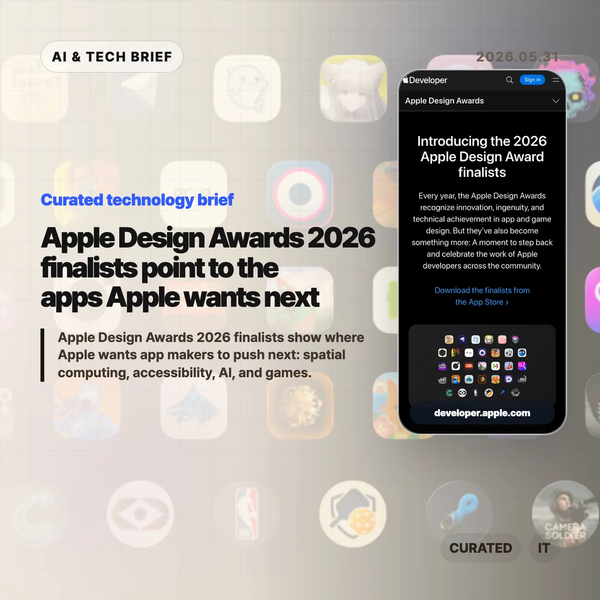
    Apple published the finalists for the 2026 Apple Design Awards ahead of WWDC. The official page groups apps and games into six categories: Delight and Fun, Inclusivity, Innovation, Interaction, Social Impact, and Visuals and Graphics.

    The names are broad on purpose. Blippo+, Metaballs, grug, Guitar Wiz, Hearing Buddy, Structured, Detail: AI Video Editor, NBA: Live Games & Scores, Primary: News in Depth, Harvee, Caradise, (Not Boring) Camera, Cyberpunk 2077 Ultimate Edition, Arknights: Endfield, and SILT all appear on the finalist page. That range matters because it shows how wide Apple’s definition of design has become.

    Design here does not mean a cleaner settings screen. It means how an app uses the device, how quickly it makes sense to a new user, whether it works for people with different abilities, and whether the platform-specific work feels worth the effort.

    Apple Design Awards 2026 as a product signal

    Apple Design Awards 2026 finalists usually double as a reading list for app teams. If Apple keeps pointing to a kind of experience in awards, sessions, and sample code, developers tend to see that pattern again in App Store featuring and platform guidance.

    This year’s pattern is pretty clear. Spatial computing is no longer treated as a side experiment. Metaballs uses a spatial canvas, NBA brings multi-game viewing to Vision Pro, and Caradise frames a car museum as an immersive environment with 3D visuals and spatial audio.

    The better question for developers is not “Can this app run on Vision Pro?” It is “Does this experience have a reason to exist in space?” The finalists that make the strongest case are the ones where layout, input, audio, and attention feel connected.

    For more English tech briefs from this site, see the IT & AI archive.

    Why this is worth watching

    The accessibility signal is just as important. Guitar Wiz, Hearing Buddy, and Structured are not presented as charity features or compliance work. They are framed as better product design.

    That is the part more teams should copy. VoiceOver, Dynamic Type, captioning, color contrast, low-friction input, and readable structure belong in the product plan early. Adding them at the end usually leaves them feeling bolted on.

    The AI angle is also quieter than the market hype around AI apps. Detail uses AI to speed up video editing. Hearing Buddy turns speech into captions and summaries. Structured and Harvee point toward assistance inside planning and health workflows. The user benefit is not that a model exists. The benefit is that the app removes a step, shortens a task, or makes messy information easier to act on.

    Games tell the other half of the story. Cyberpunk 2077 Ultimate Edition and Arknights: Endfield put Metal, Apple silicon, hardware-accelerated graphics, and spatial audio in front of developers who still think of Mac and iPad as productivity-first platforms. Apple is using a design award list to make a performance argument.

    What Hacker News readers are arguing about

    The Hacker News submission exists, but it did not attract a substantive thread. That absence is useful in its own way: there is no visible technical debate to synthesize, no repeated objection about the finalist choices, and no clear builder consensus beyond the submitted link.

    So the safer read is to treat the Hacker News page as a pointer, not as evidence of community sentiment. If a discussion appears later, the questions worth watching are predictable: whether Apple is over-indexing on Vision Pro, whether awards translate into App Store discovery, and whether the AI examples feel useful enough to matter after the keynote cycle ends.

    The practical read

    If you build for Apple platforms, the Apple Design Awards 2026 list is a checklist, not homework to copy.

    Start with the platform fit. A visionOS app needs a reason to be spatial. An iPhone app needs to respect one-handed use, interruption, and privacy. A Mac app should justify the screen space and performance it asks for.

    Then look at accessibility as product quality. Test VoiceOver. Support Dynamic Type. Avoid color-only states. Give users captions or transcripts when audio matters. These choices are easy to postpone, but the finalist list is a reminder that Apple notices when they are part of the main flow.

    Finally, be honest about AI. If a model removes editing drudgery, summarizes speech locally, or helps a user structure a day, it can earn its place. If it is there because the roadmap needed an AI bullet, users will feel that too.

    Sources

  • Push notification summaries are changing who controls alerts

    Push notification summaries are changing who controls alerts

    Push notification summaries now sit between the app that sends an alert and the person who sees it. Apple and Google still run the delivery pipes through APNs and FCM, but the more interesting shift happens on the device, where Focus modes, notification channels, ranking systems, and AI summaries decide what appears on the lock screen.

    The short version

    • Apple and Google have always mediated mobile push through APNs and FCM, so the channel was never fully owned by app teams.
    • The newer layer is editorial: iOS and Android can group, delay, rank, or summarize notifications after delivery.
    • Push notification summaries make vague marketing copy riskier because the operating system may compress it into something less accurate or less persuasive.
    • Hacker News readers mostly sided with users, arguing that promotional pushes created the conditions for platform-level filtering.
    • App teams should measure downstream behavior, keep transactional alerts clean, and build owned surfaces such as in-app inboxes for anything important.

    What happened

    Jacques Corby-Tuech argues that push notifications are following the same path as email: a channel that once looked like transport is becoming an actively managed surface. On iOS, every third-party alert passes through Apple’s push service. On Android, it passes through Google’s Firebase Cloud Messaging or its predecessors. That architecture has existed for years, but the visible editing layer has become much stronger.

    The article traces the shift from battery-saving infrastructure to user and platform control. Android 8 introduced notification channels in 2017. iOS 15 added Focus modes, Scheduled Summary, and interruption levels. Android 13 made notification permission an explicit runtime grant. Apple Intelligence and Google’s Gemini Nano add another layer by summarizing, ranking, and organizing text on the device.

    The point is not that every alert gets rewritten. The point is that app teams can no longer assume that “delivered” means “shown as written.” For more coverage of mobile and AI platform shifts, see the IT & AI archive.

    Why this is worth watching

    Push notification summaries matter because the last mile is no longer just a UI template. The operating system can decide whether an alert belongs in a quiet batch, whether it looks time-sensitive, whether it should be grouped with other messages, or whether an AI-generated line is a better lock-screen representation than the sender’s original copy.

    How push notification summaries change control

    That creates an awkward measurement problem. APNs or FCM delivery tells a team that the platform accepted the message. It does not tell them whether the user saw it, whether a Focus mode hid it, whether Android organized it into a lower-priority bucket, or whether an AI summary changed its meaning. The old email lesson applies here: proxy metrics can survive long after they stop measuring what teams think they measure.

    It also changes copywriting. “Big update today” is easy to compress badly. “Your 6 p.m. delivery moved to 6:30” gives the system less room to blur the point. Amounts, names, times, status changes, and direct next actions are more likely to survive summarization than brand tone or urgency language.

    What Hacker News readers are arguing about

    The Hacker News thread was lively, with more than 300 comments, and the strongest reaction was not sympathy for marketers. Many readers framed push as a user-owned surface, not a sender-owned channel. Their practical stance was simple: transactional alerts are useful, promotional alerts are usually spam, and app teams have abused that trust often enough that platform filtering feels deserved.

    A second camp accepted the author’s broader platform-power concern but wanted the blame spread around. Several commenters argued that Apple and Google have too much arbitrary control over users and developers, yet also said that users need stronger defaults because most people will not tune every app’s notification settings. In that view, platform mediation is a messy defense mechanism rather than a clean win.

    The most useful operator thread came from people who have worked at scale. One commenter described monitoring push delay, suppression, and coalescing at WhatsApp years before today’s AI summaries. That is a good reminder: push was never a guaranteed real-time pipe. The newer concern is that the intervention is becoming more semantic. It is not only “when does this arrive?” but “what does the user actually read?”

    The practical read

    If you run a mobile product, separate alerts by user intent before the platform does it for you. Transactional messages, account security, delivery changes, chat, rides, timers, and live events should live in clean channels with plain copy. Promotional pushes should be opt-in, easy to turn off, and measured by clicks or downstream actions rather than delivery counts.

    Treat push notification summaries as a constraint on product writing. Put the non-negotiable fact first. Avoid clever subject lines that only make sense with the full body. Do not rely on repeated reminders to create urgency. If a message matters after the lock screen disappears, put it somewhere durable inside the app.

    The app-store angle is easy to miss. Notification behavior now affects retention, reviews, permission prompts, and whether users trust the app enough to keep alerts enabled. For app builders, that makes push design part of the product’s discovery and retention surface, not a growth hack bolted on after launch.

    Sources